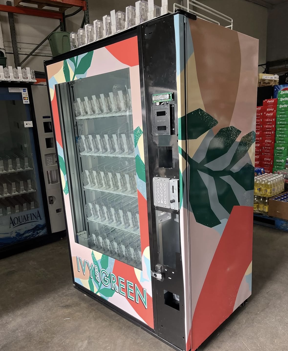
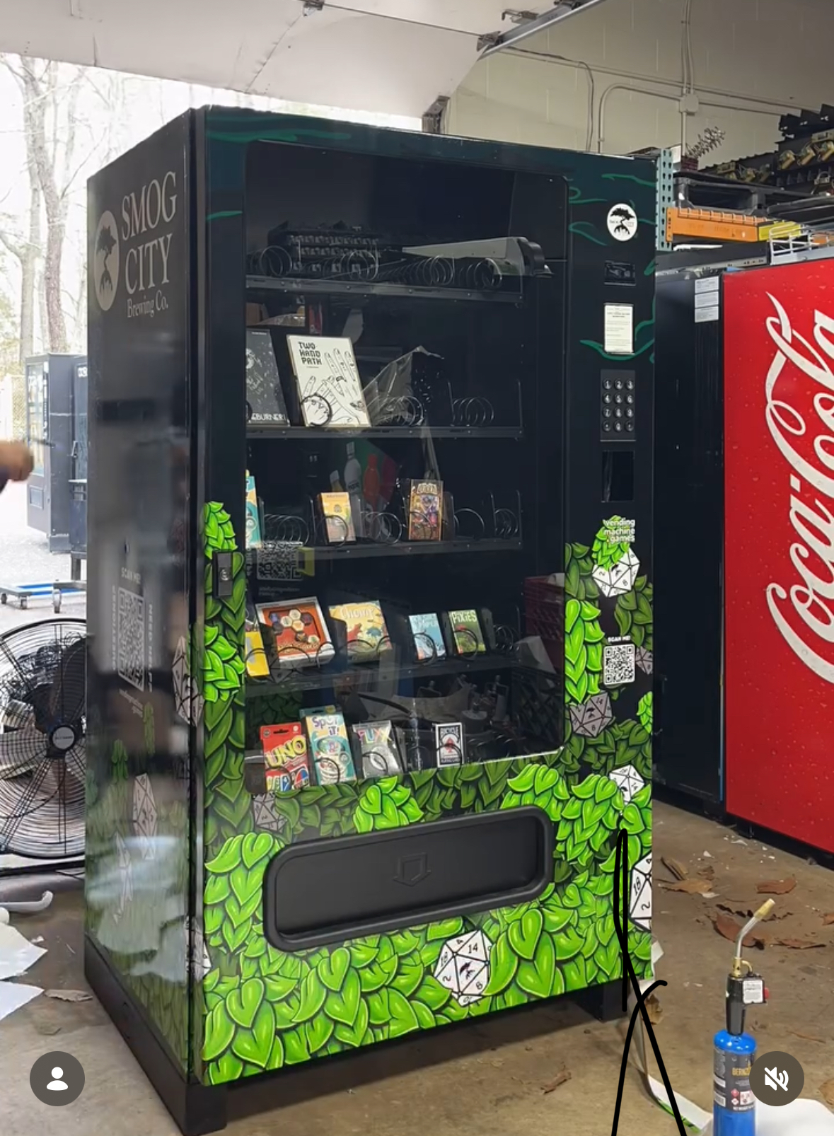
How to read a lettering photograph
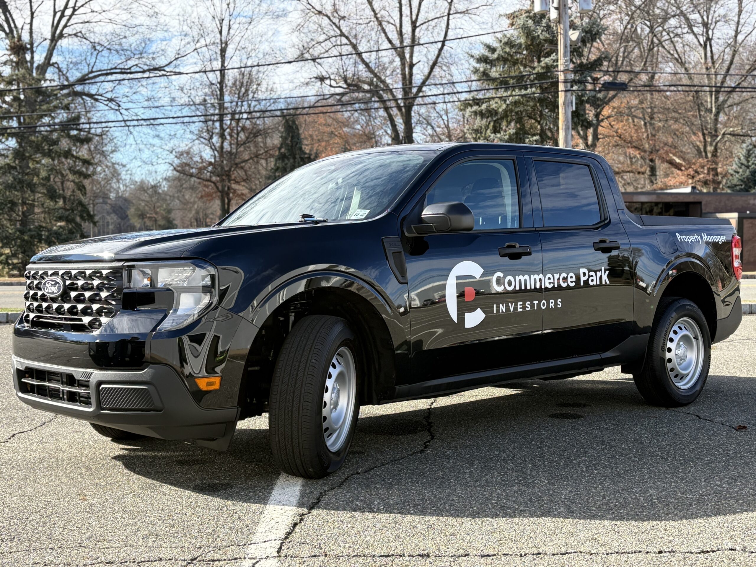
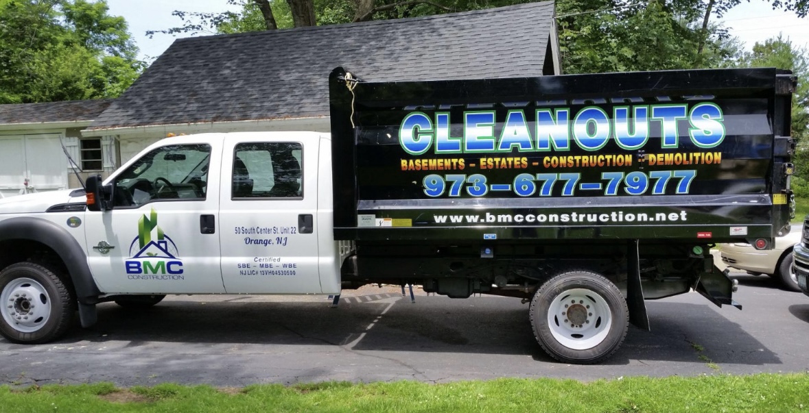
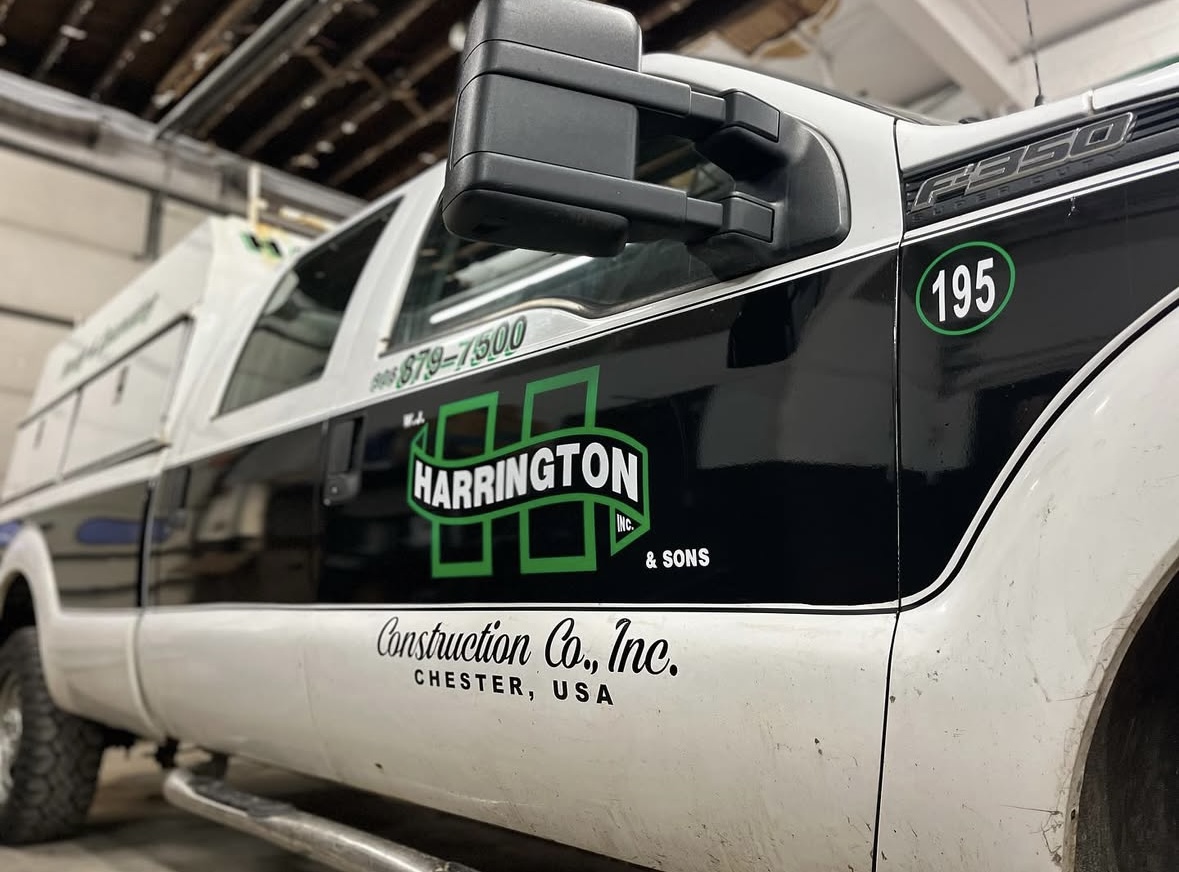
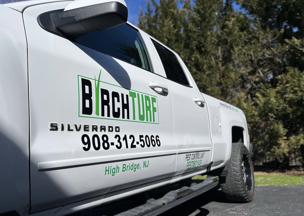
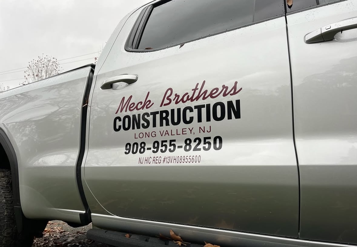
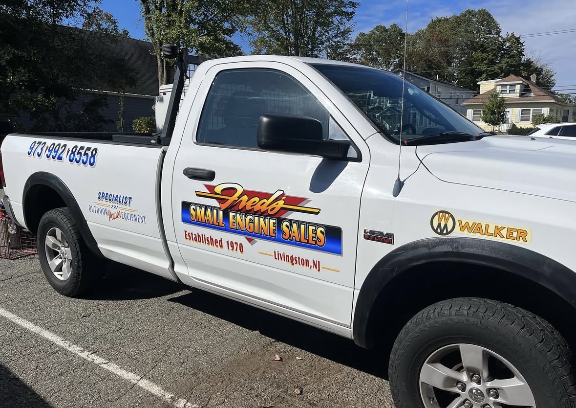
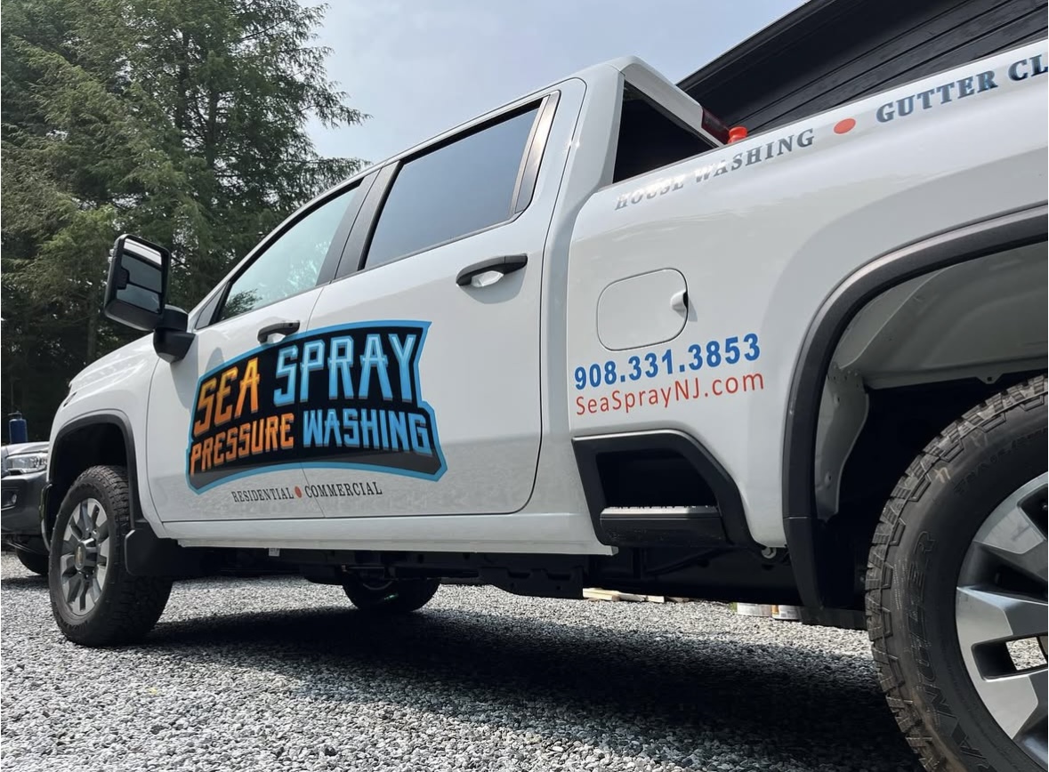
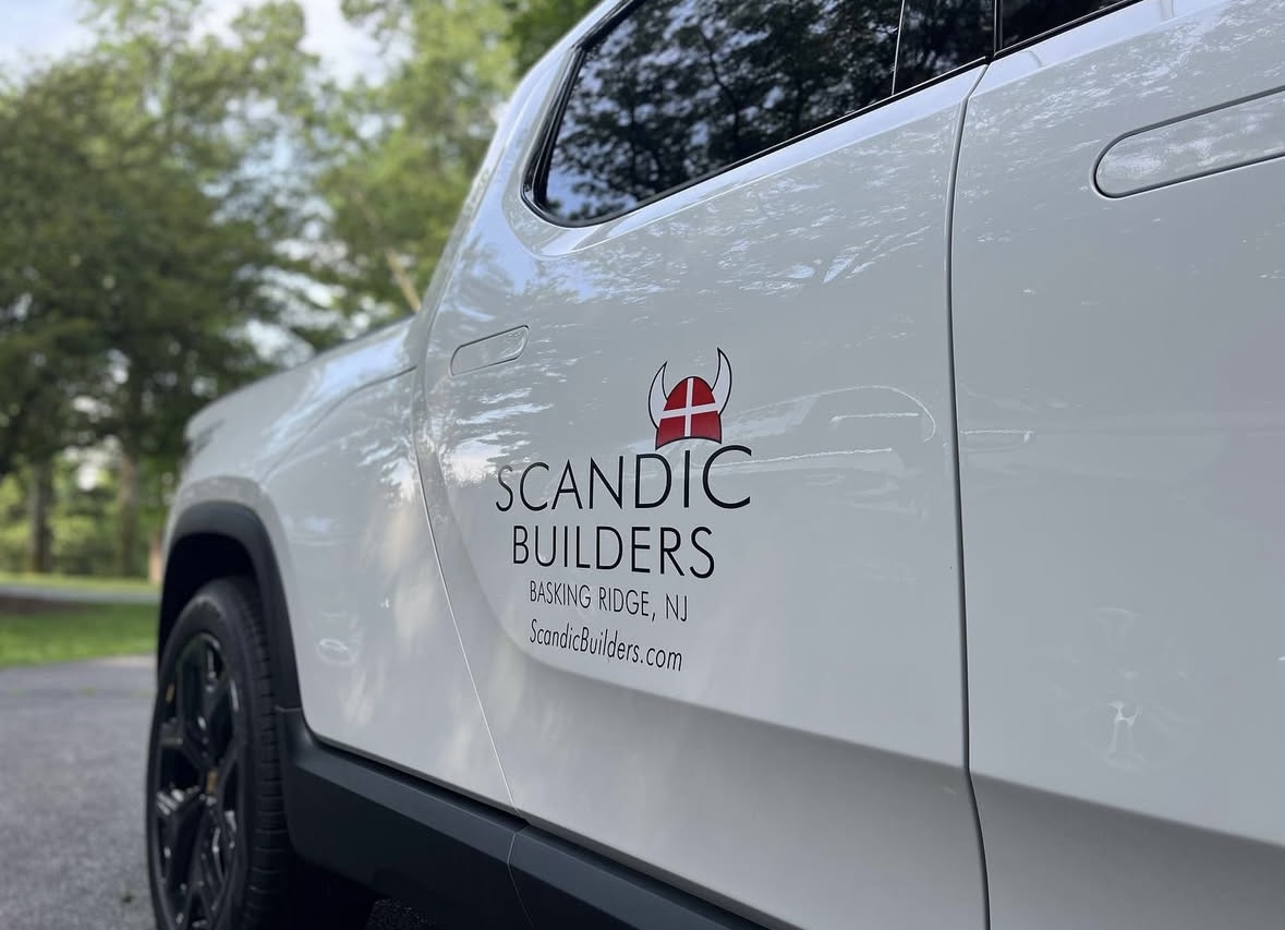
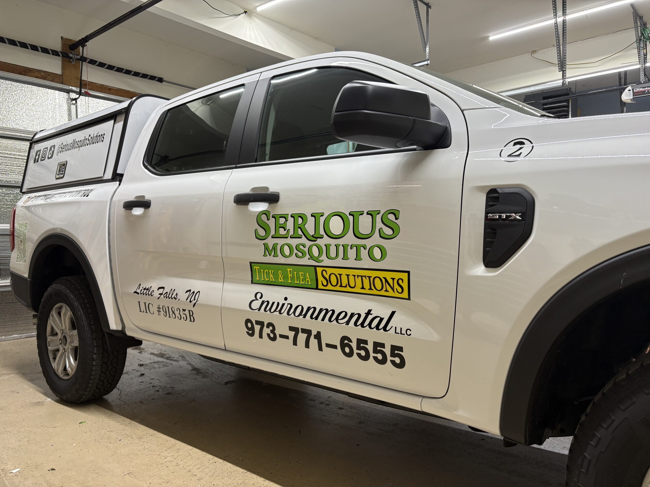
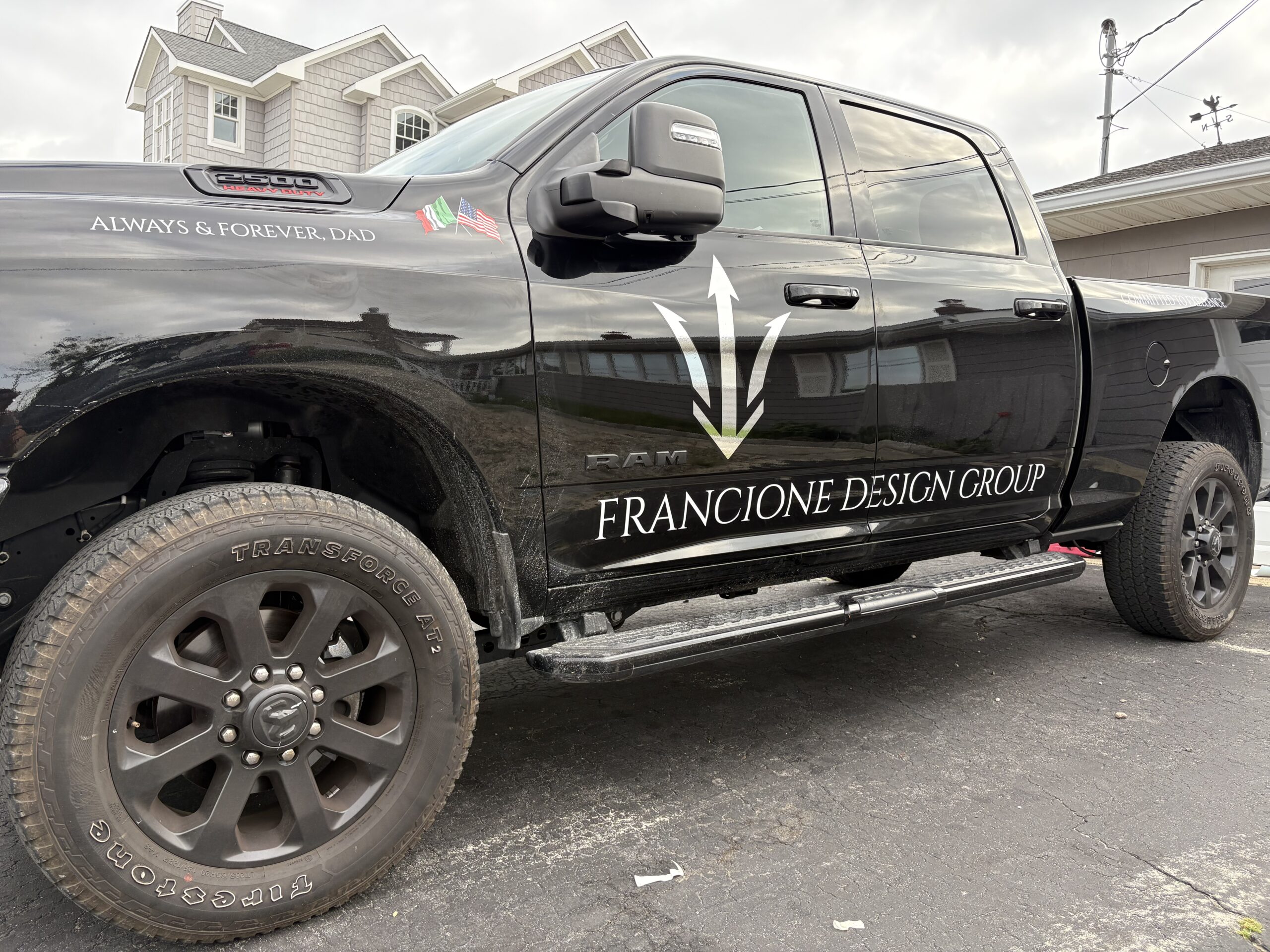
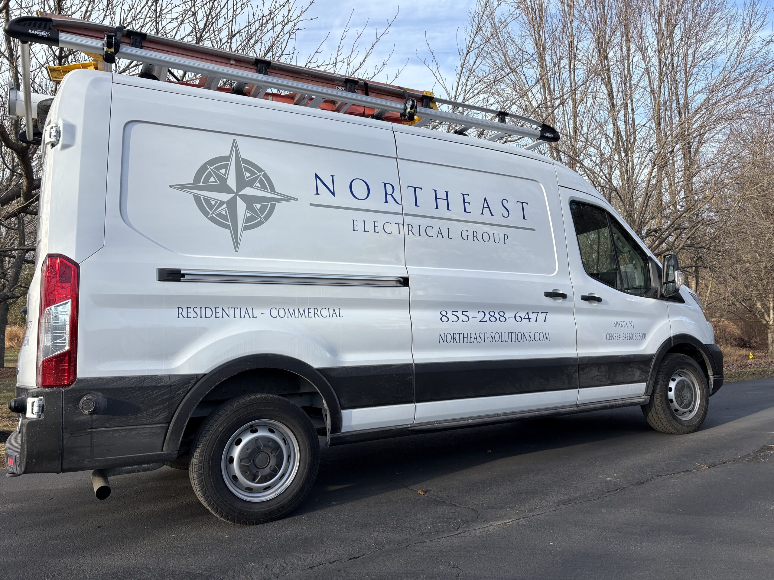
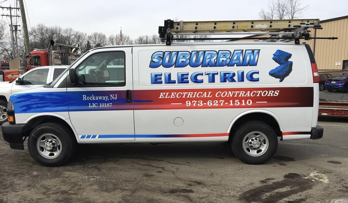
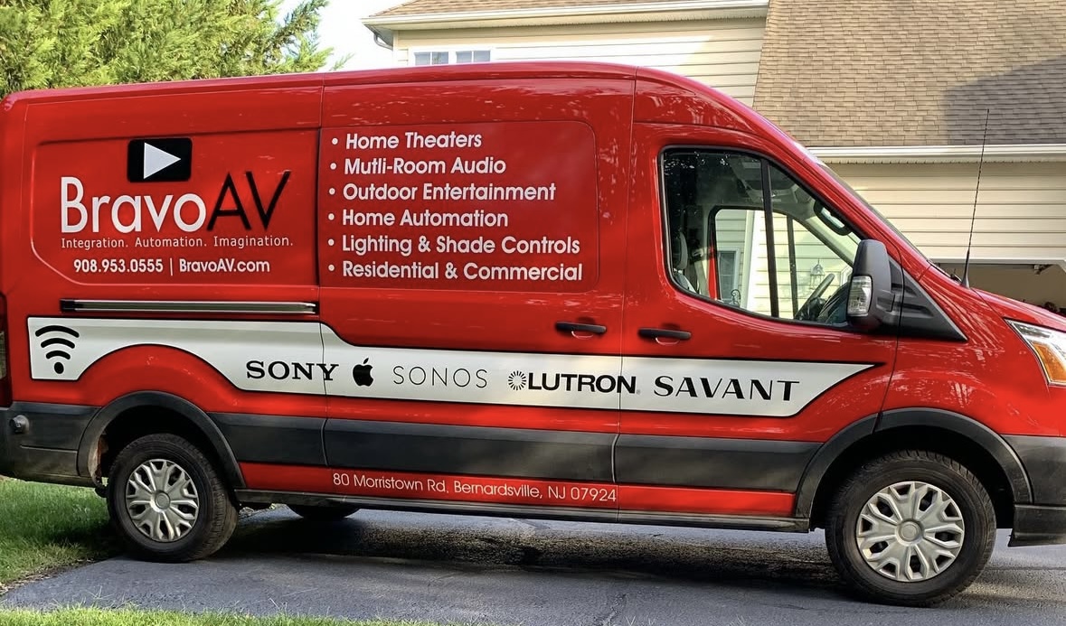
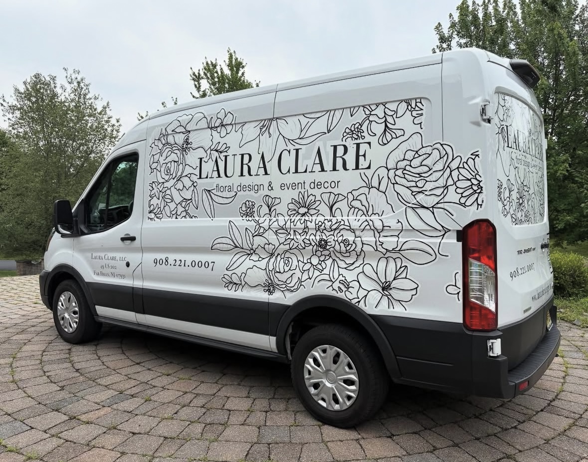
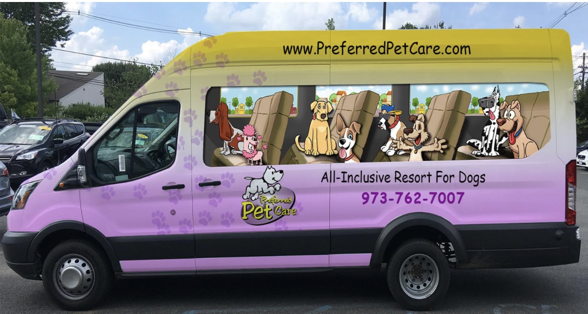
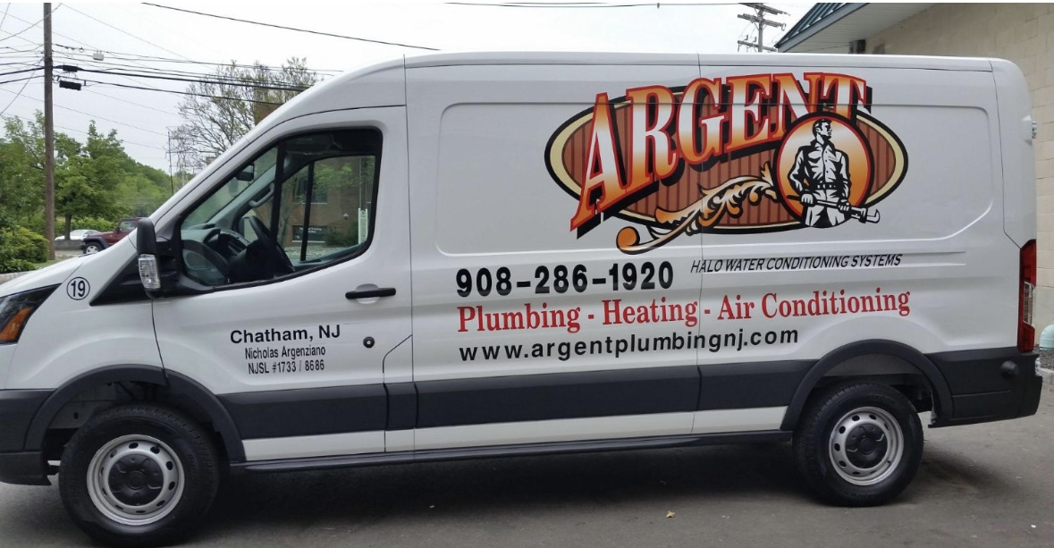
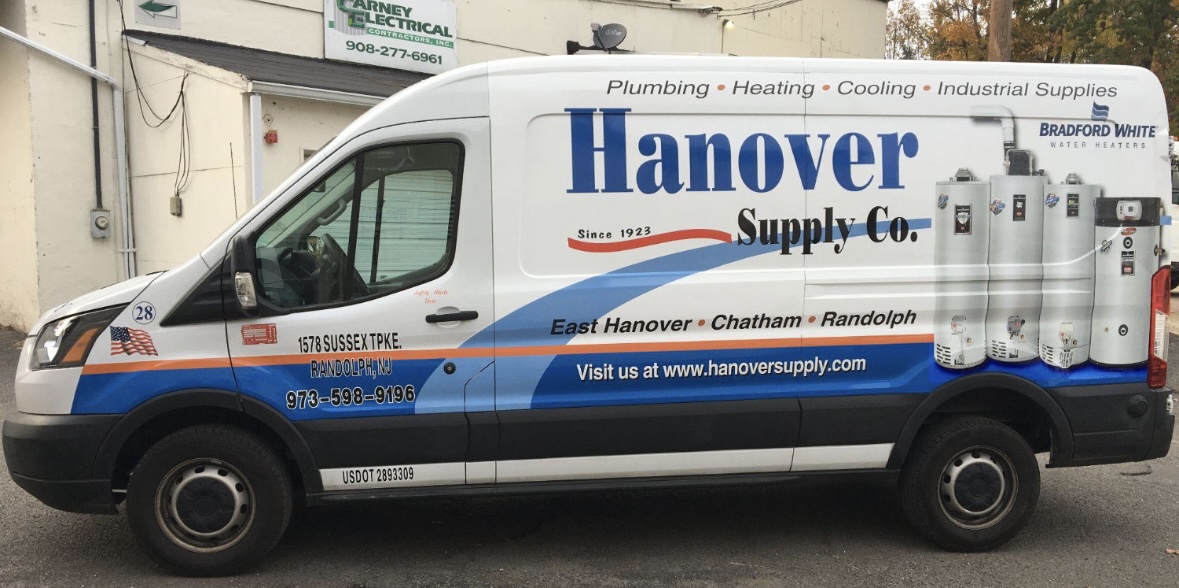
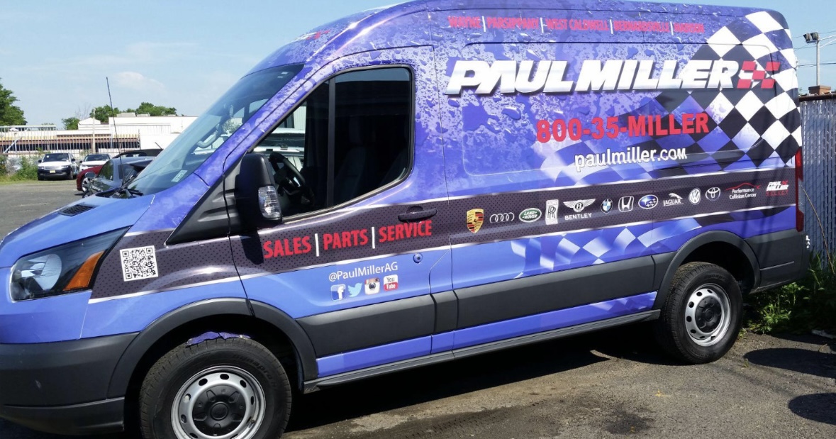
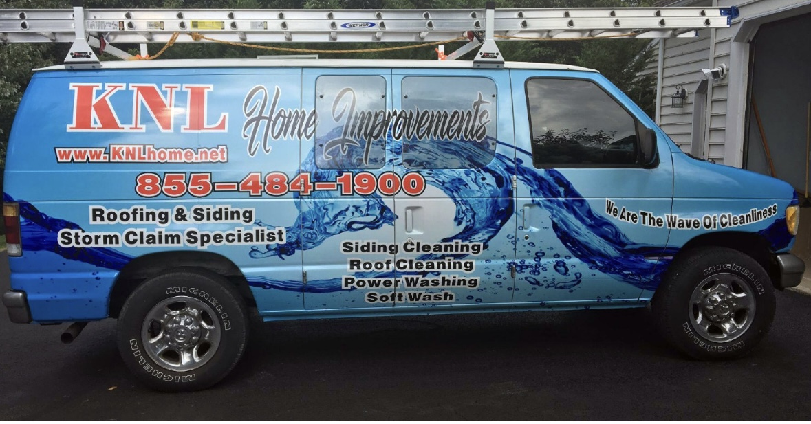
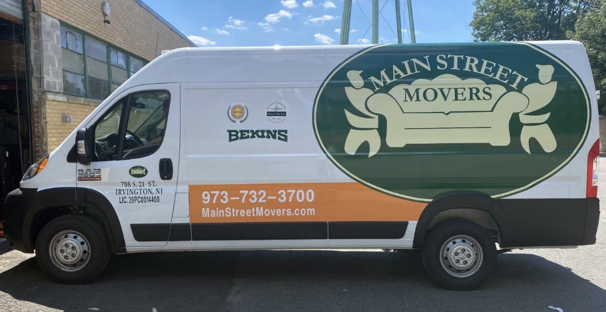
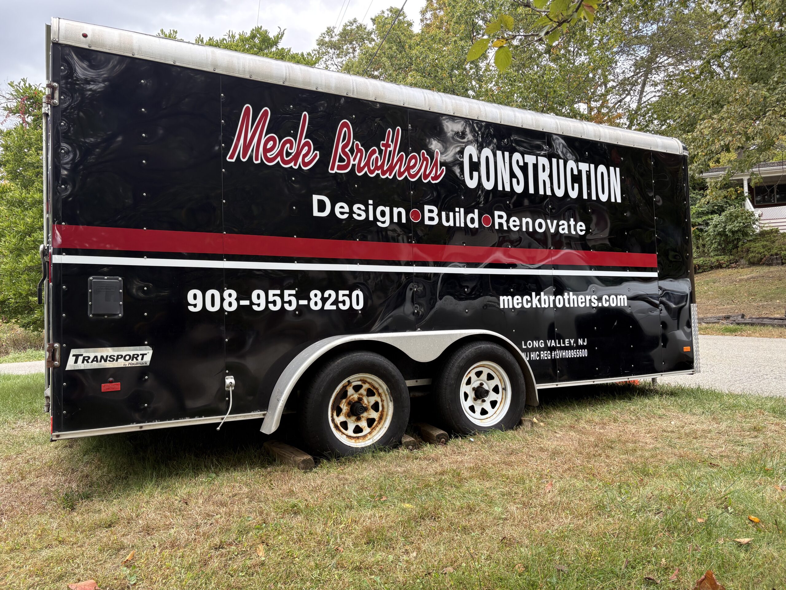
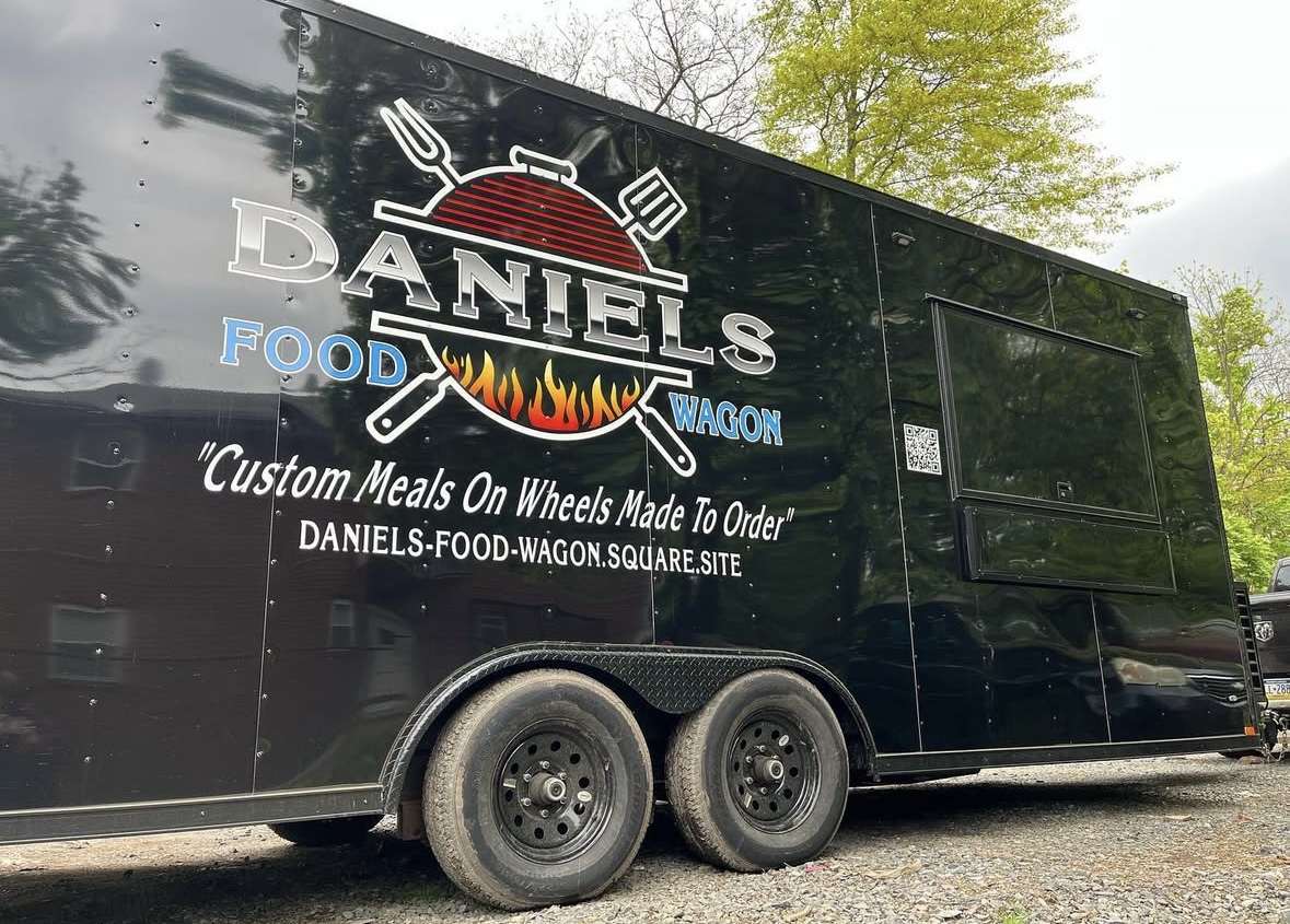
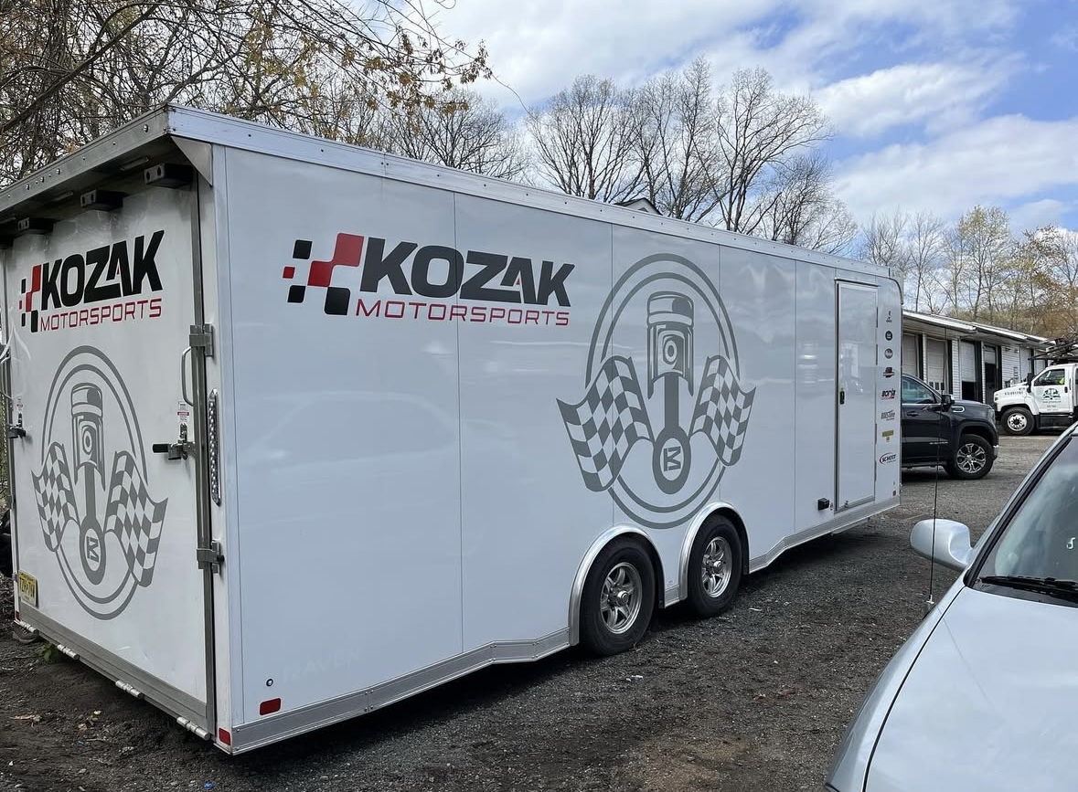
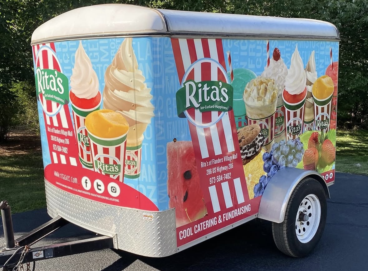
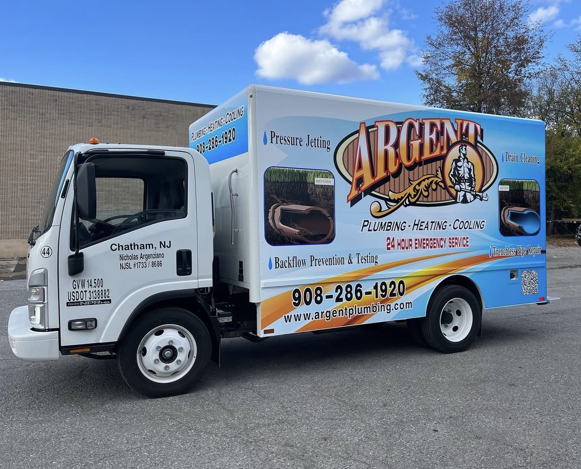
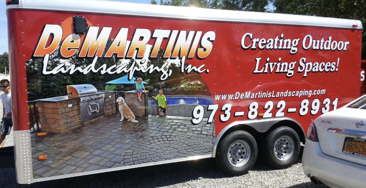
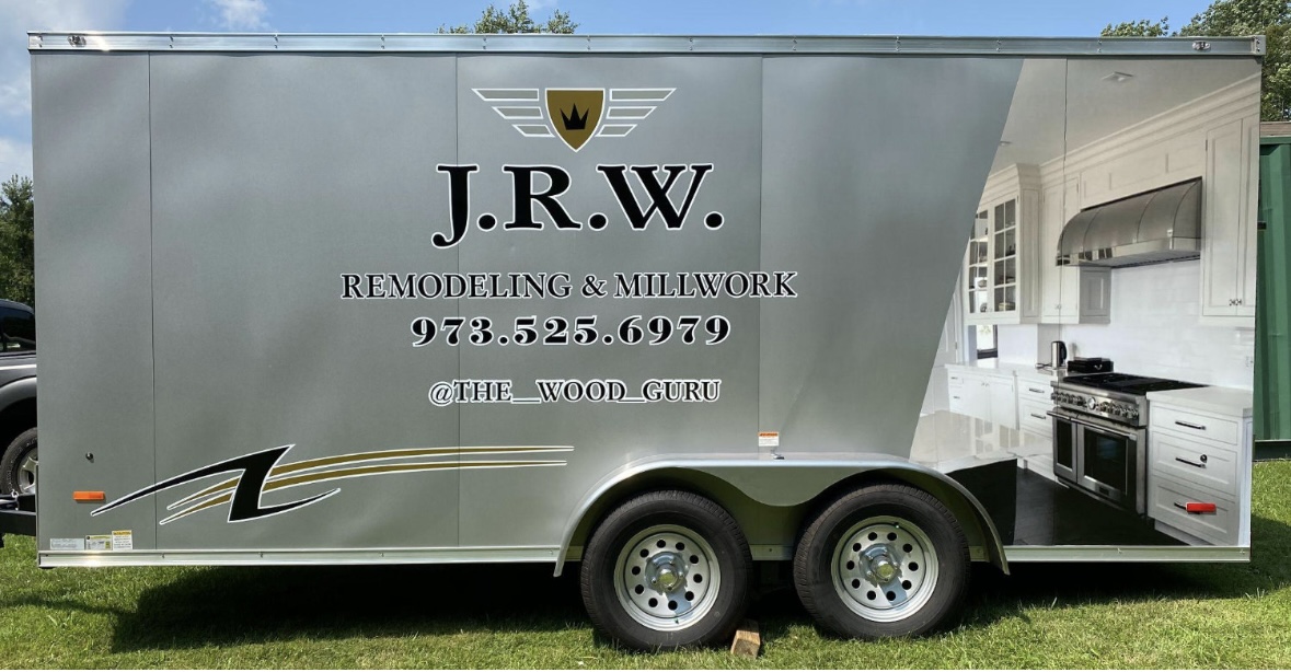
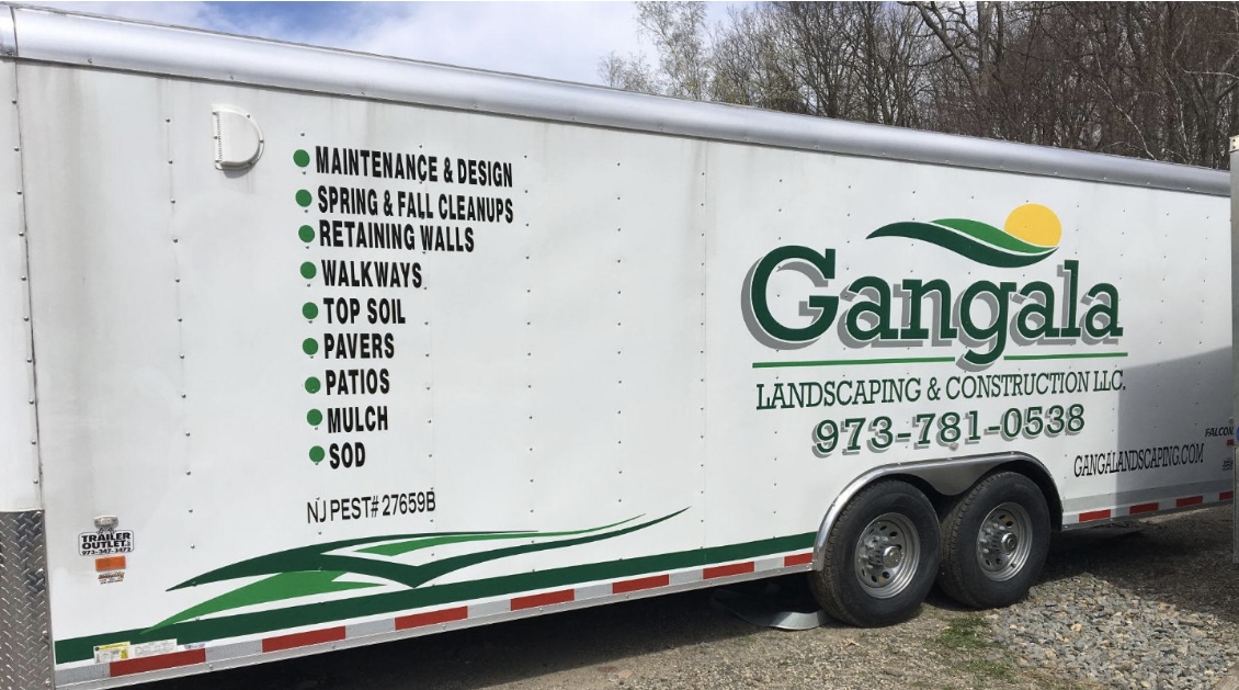
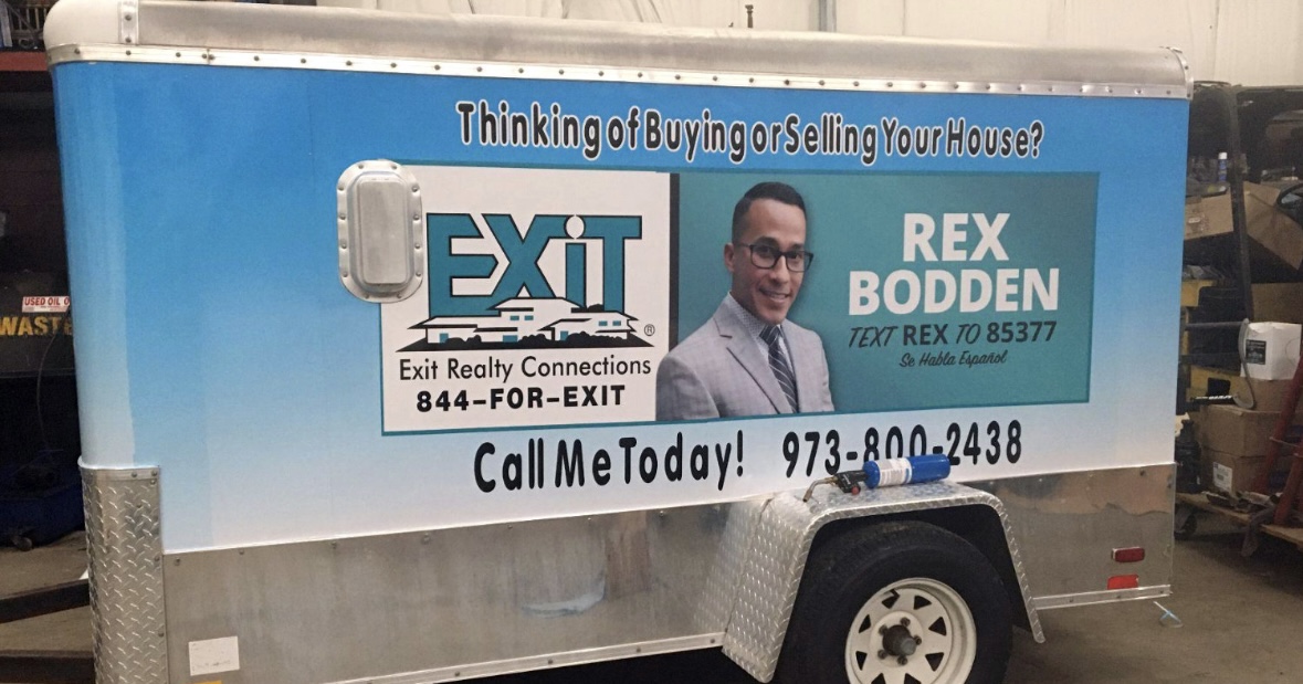
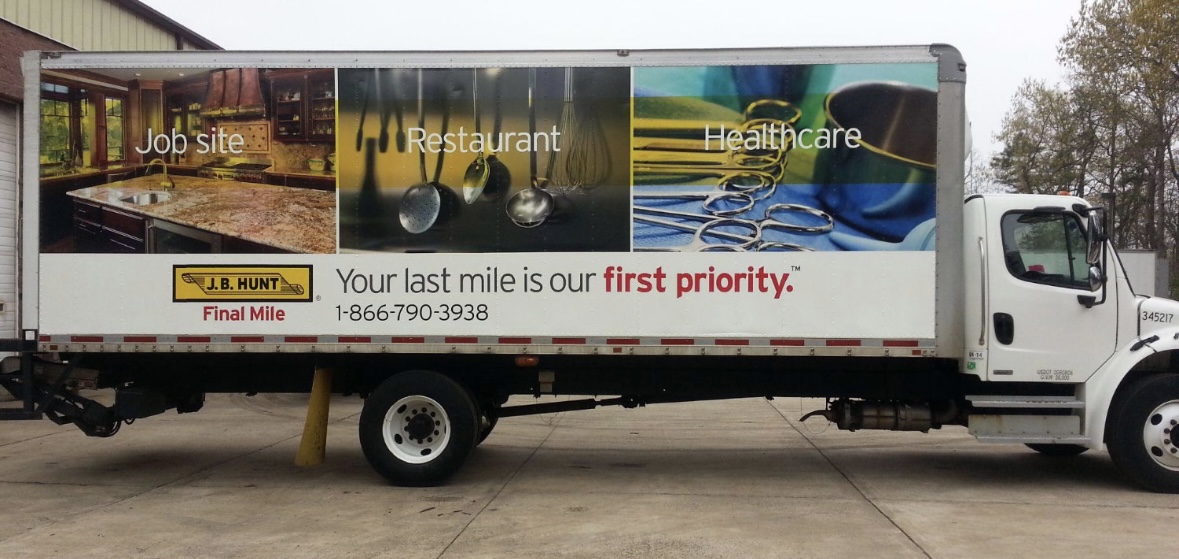
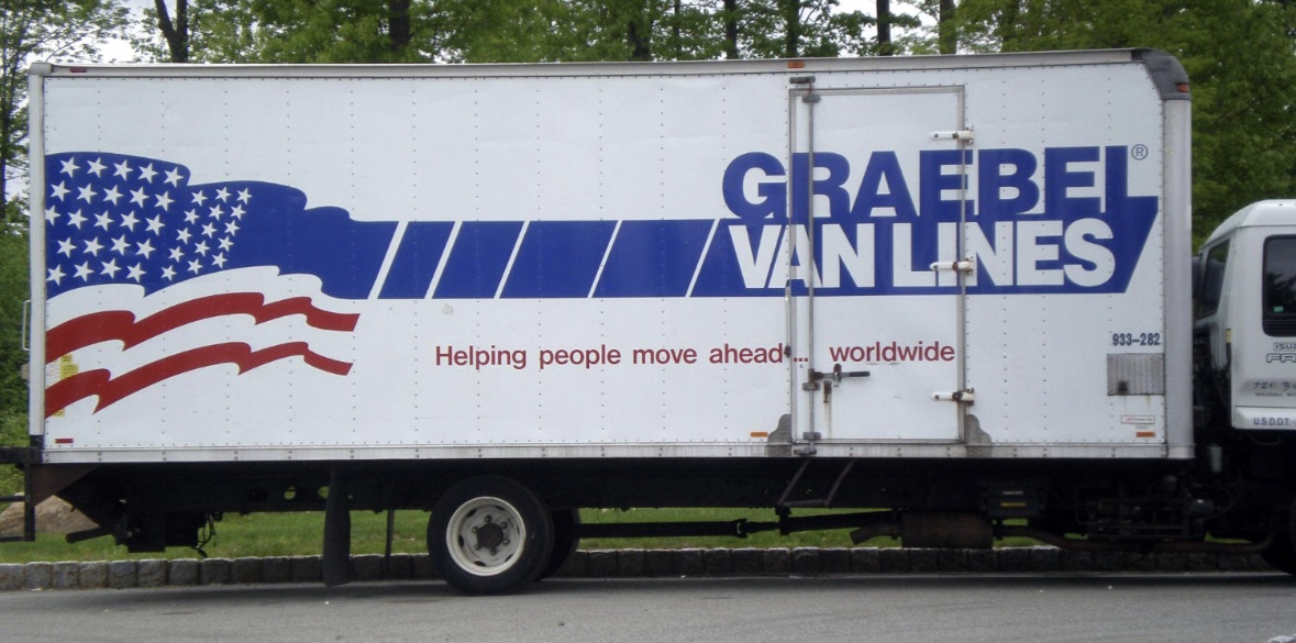
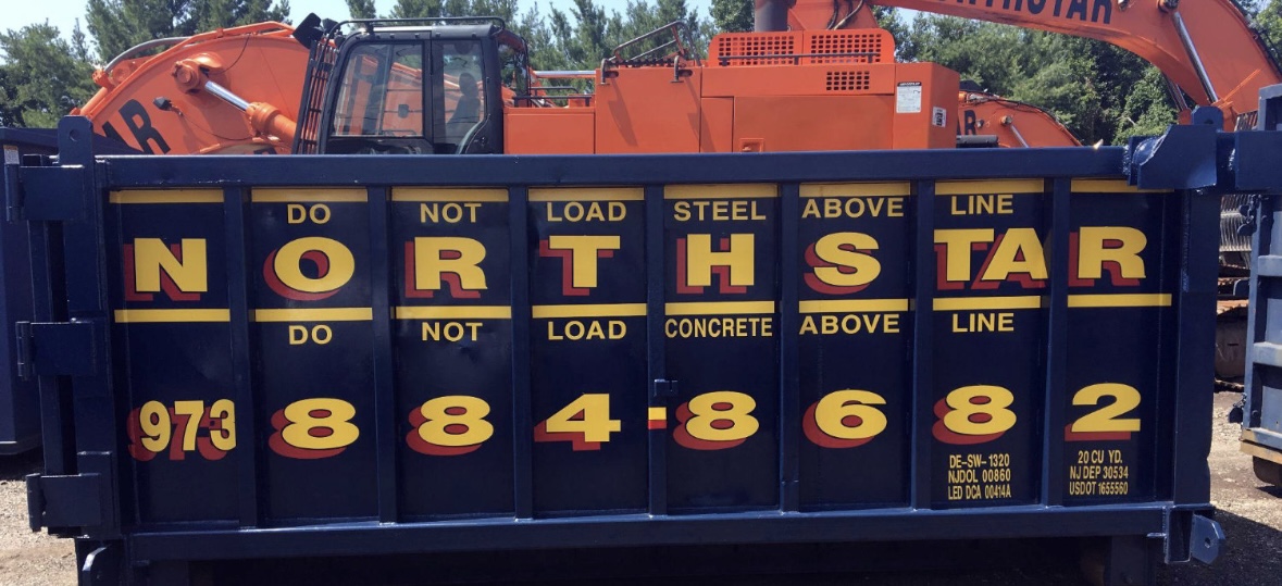
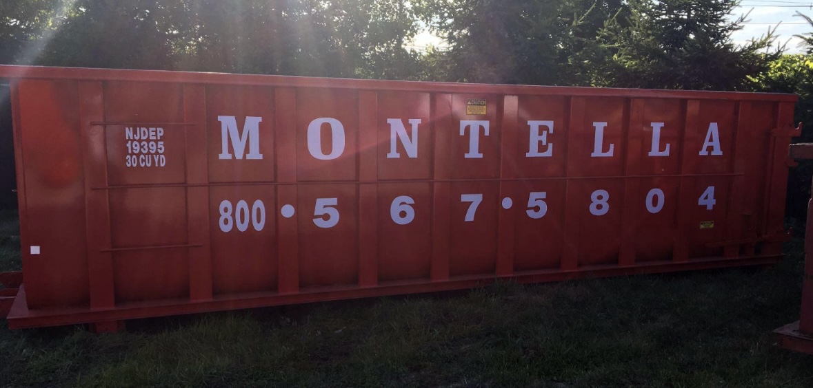
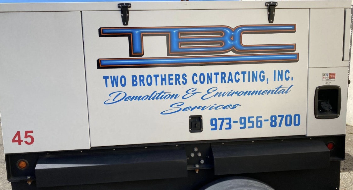
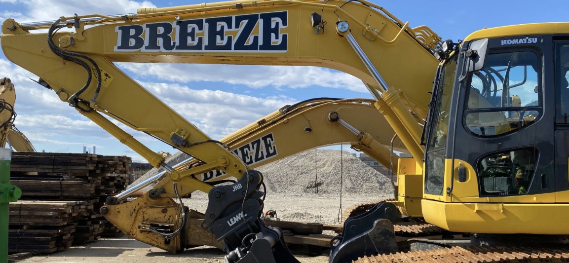
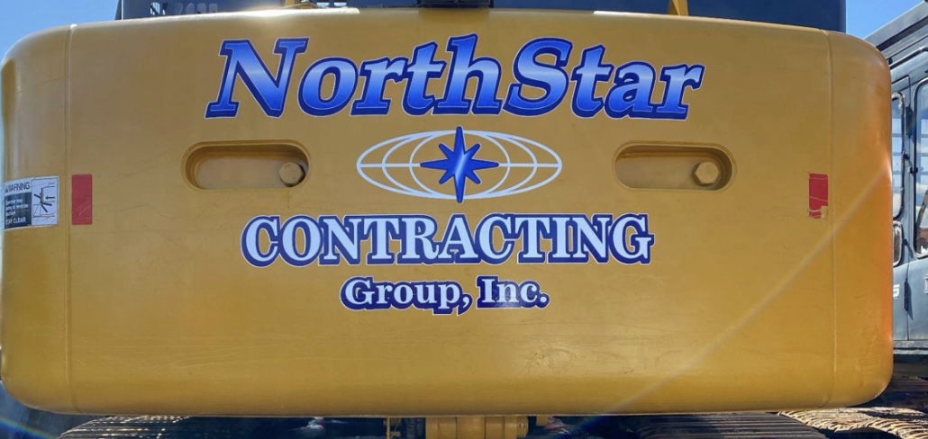
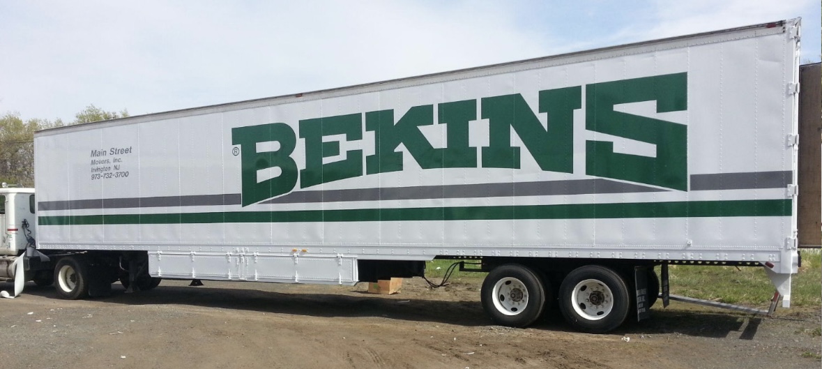
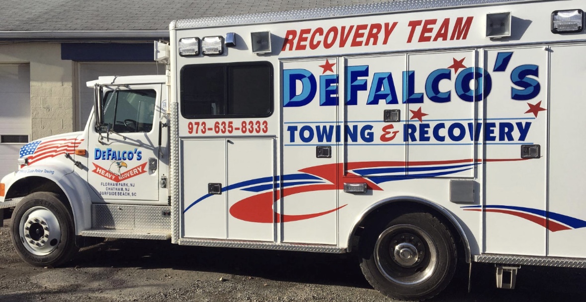
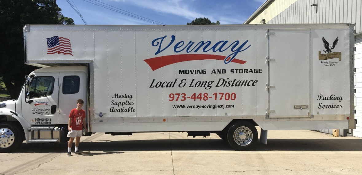
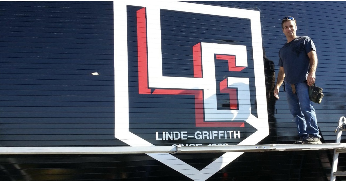
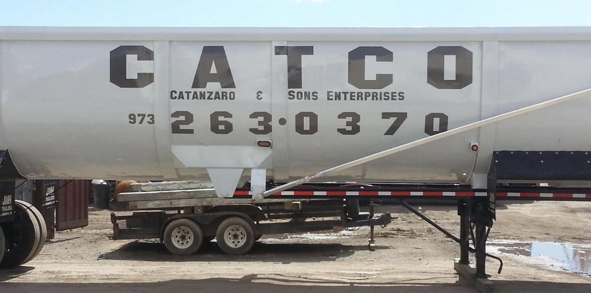
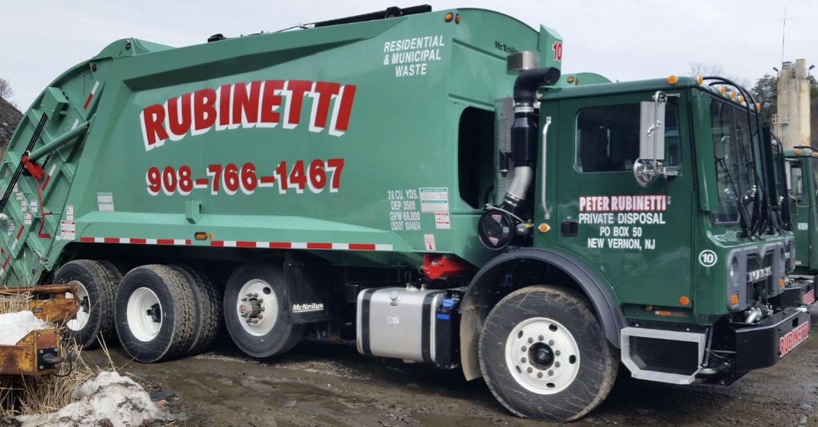
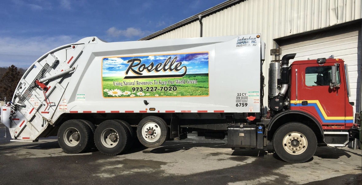
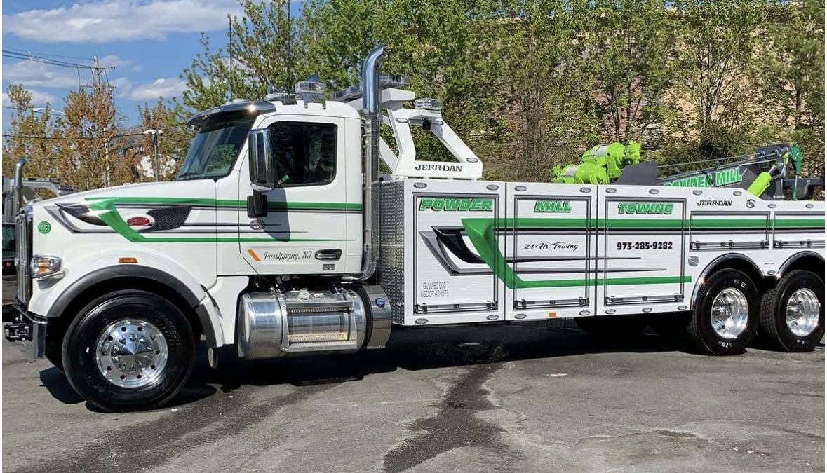
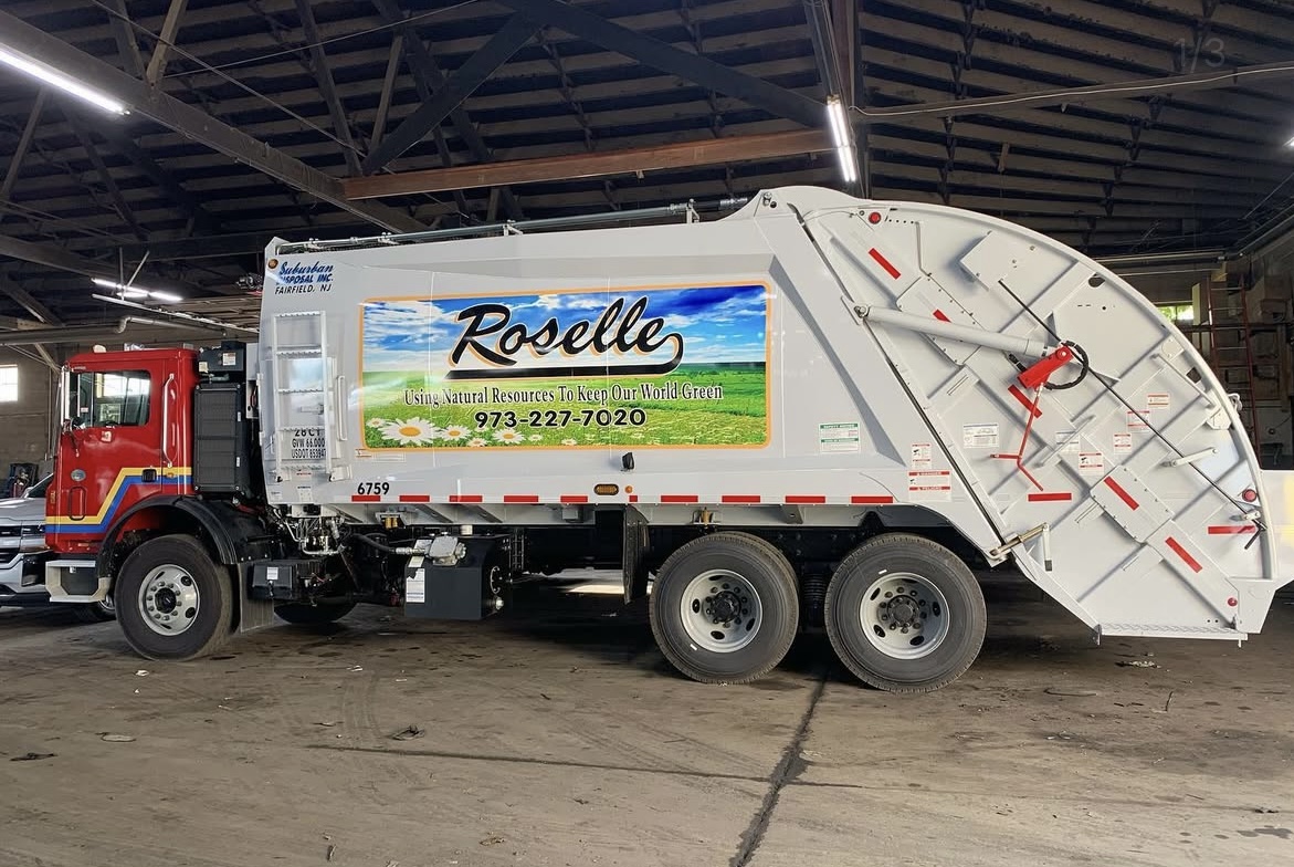
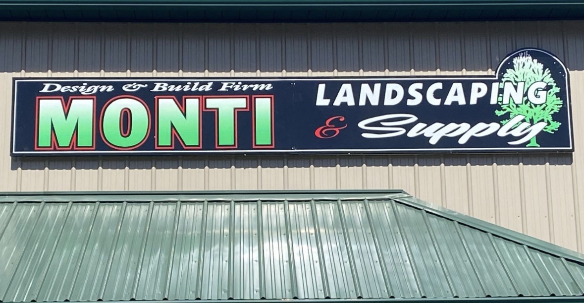
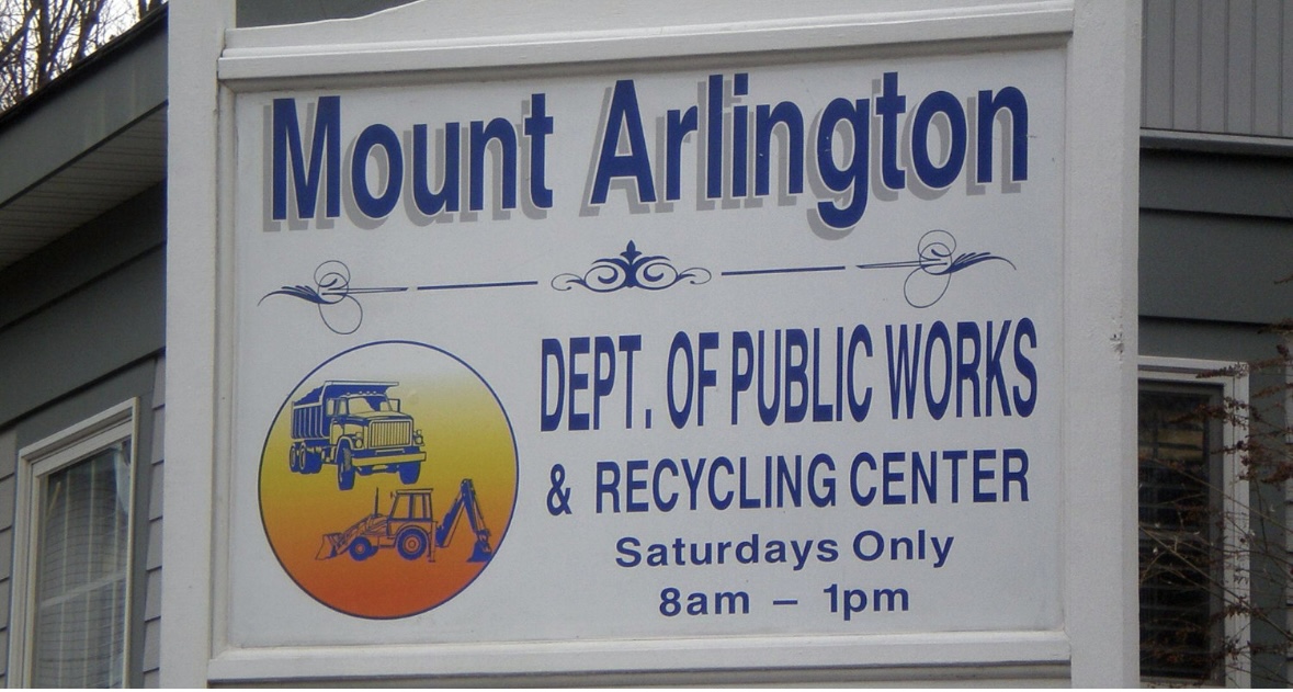
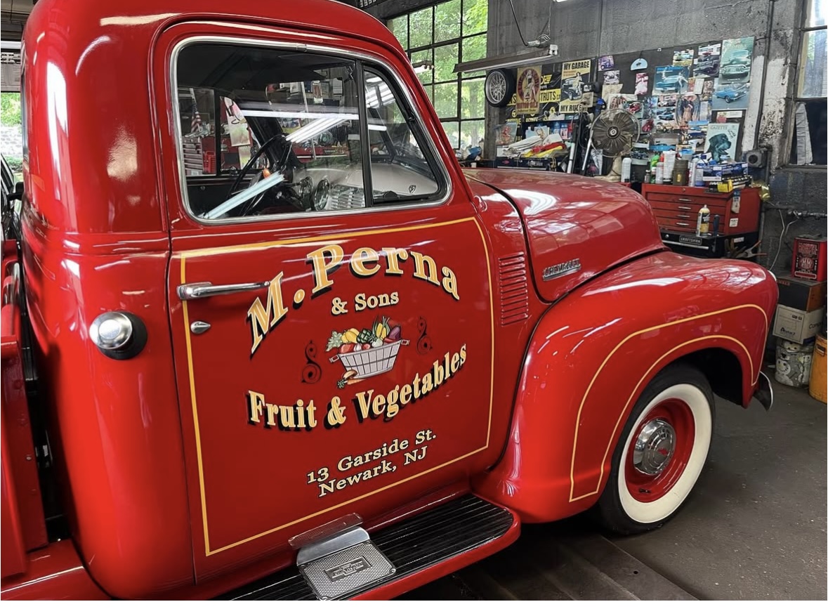
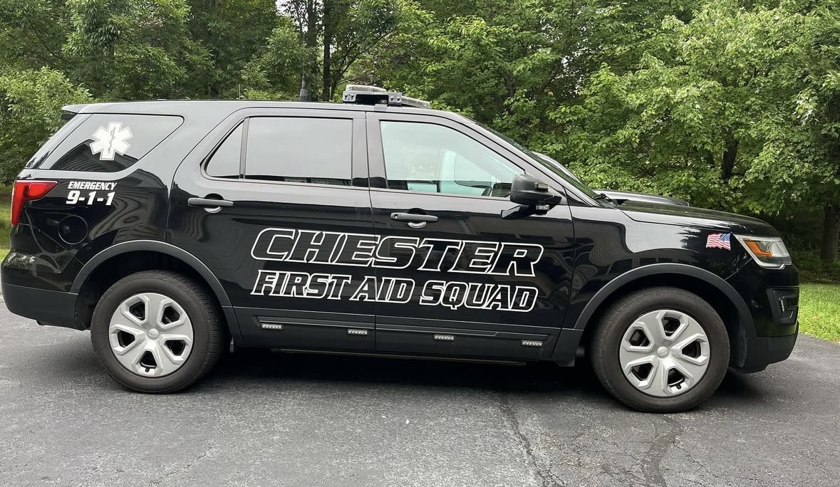
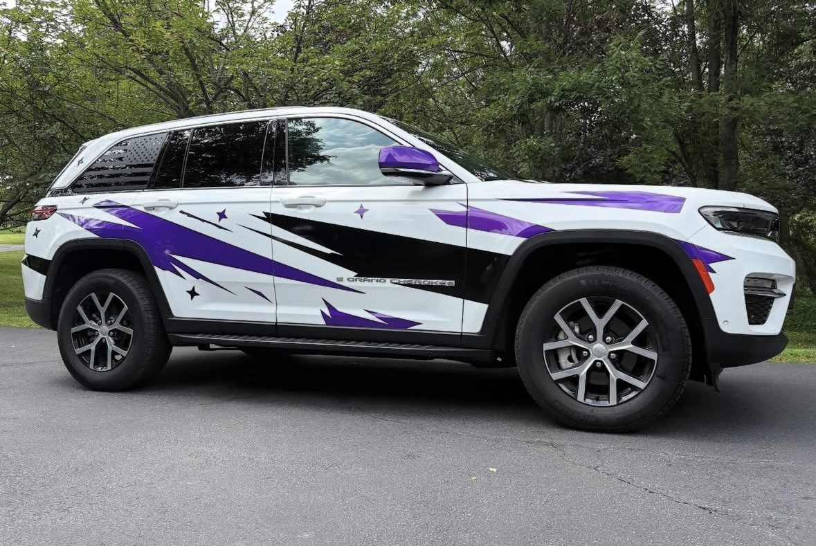
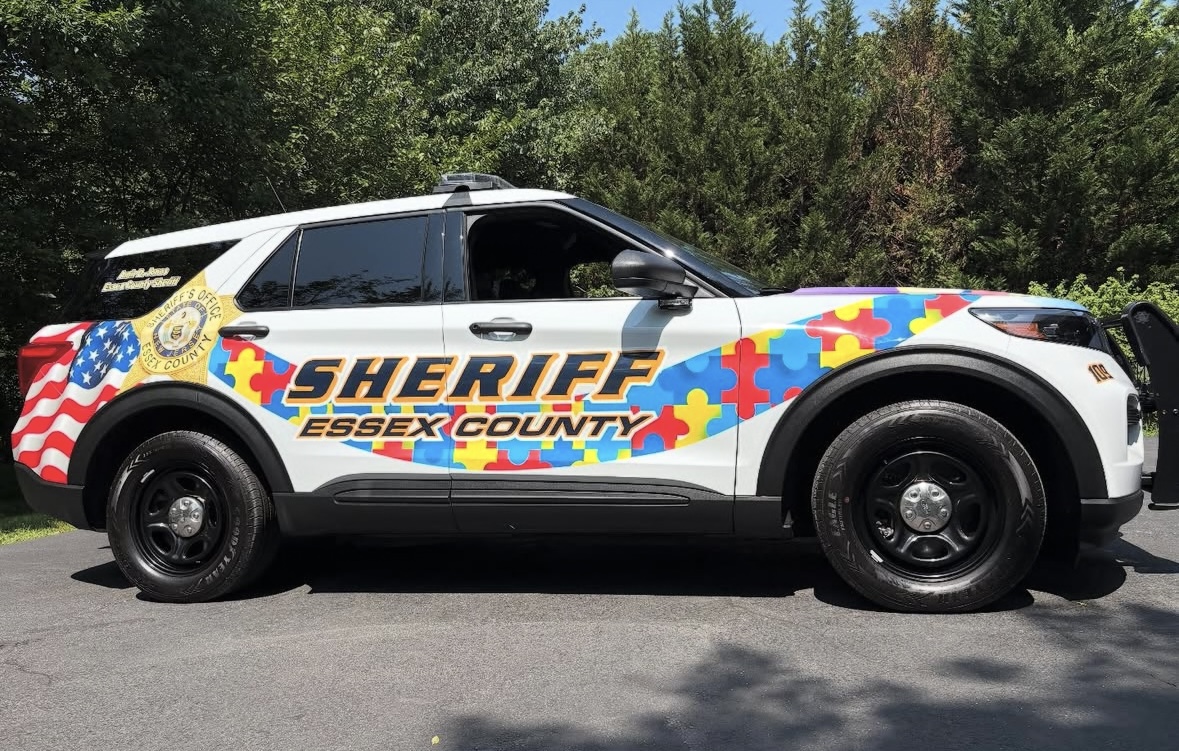
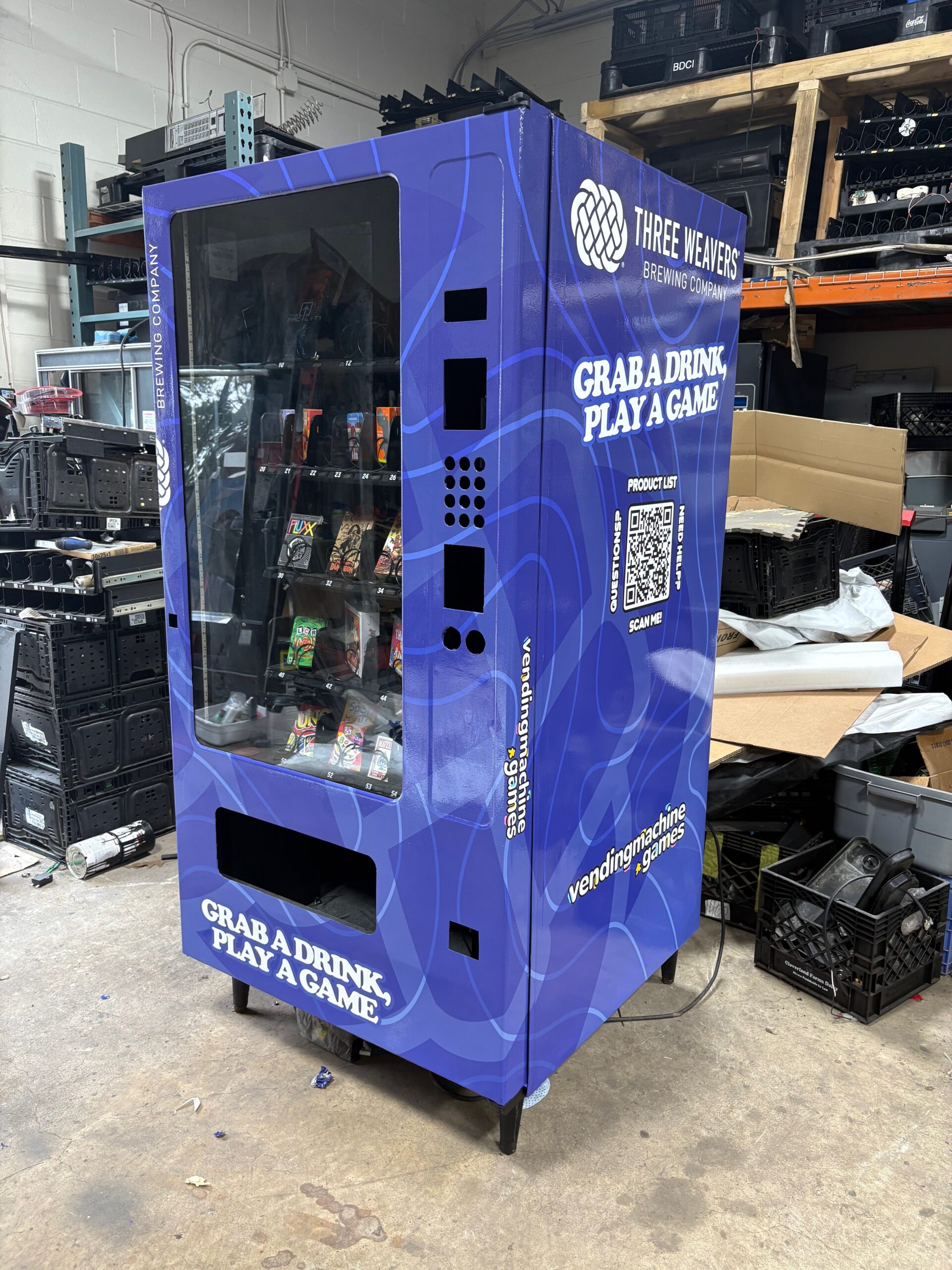
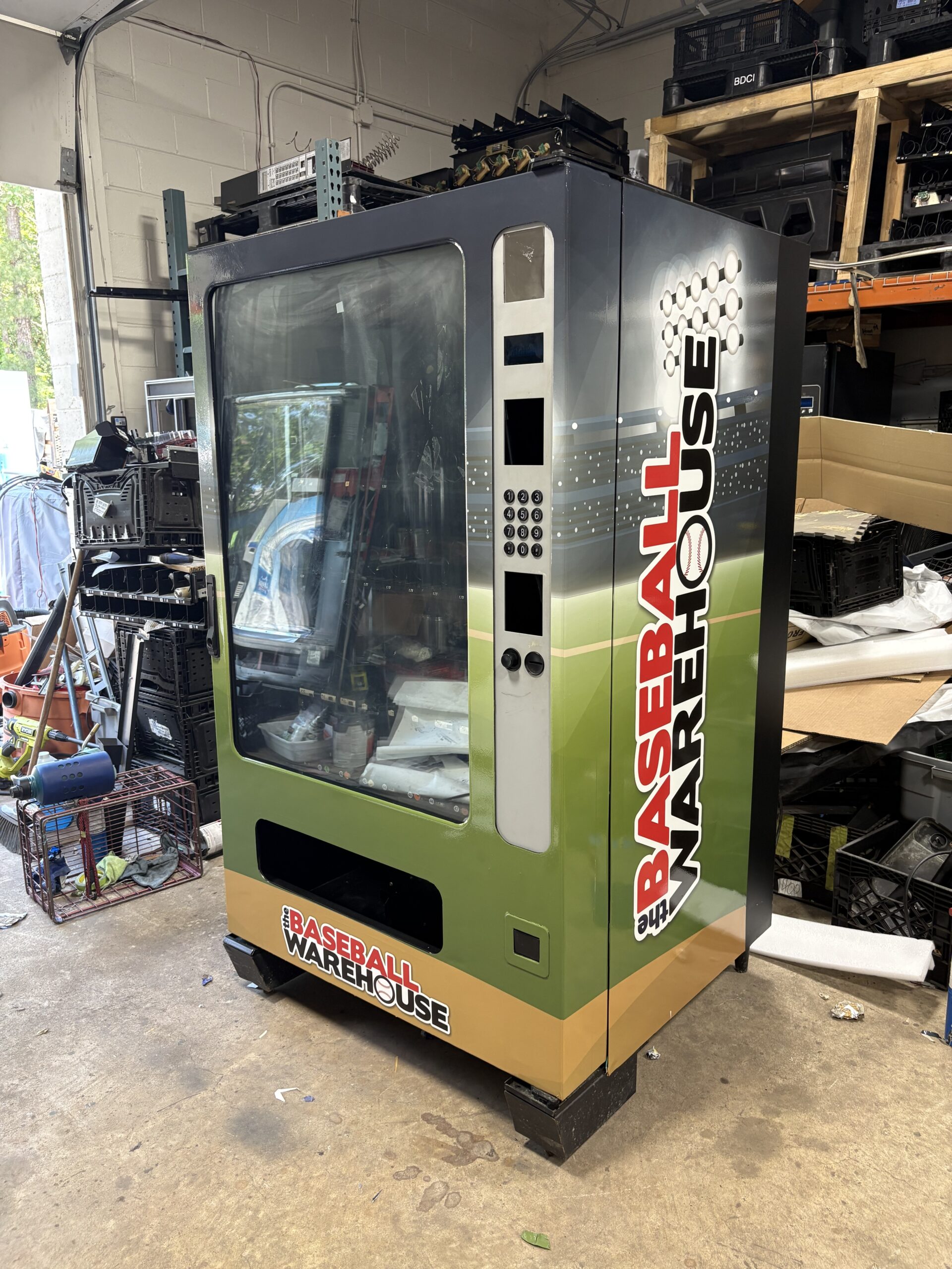
Look at the edges, the spacing and the curve. A clean job has no lifted corners, even letter spacing that stays even across a door seam, and vinyl that follows body lines instead of fighting them. Those three things are visible in a photograph; price is not.
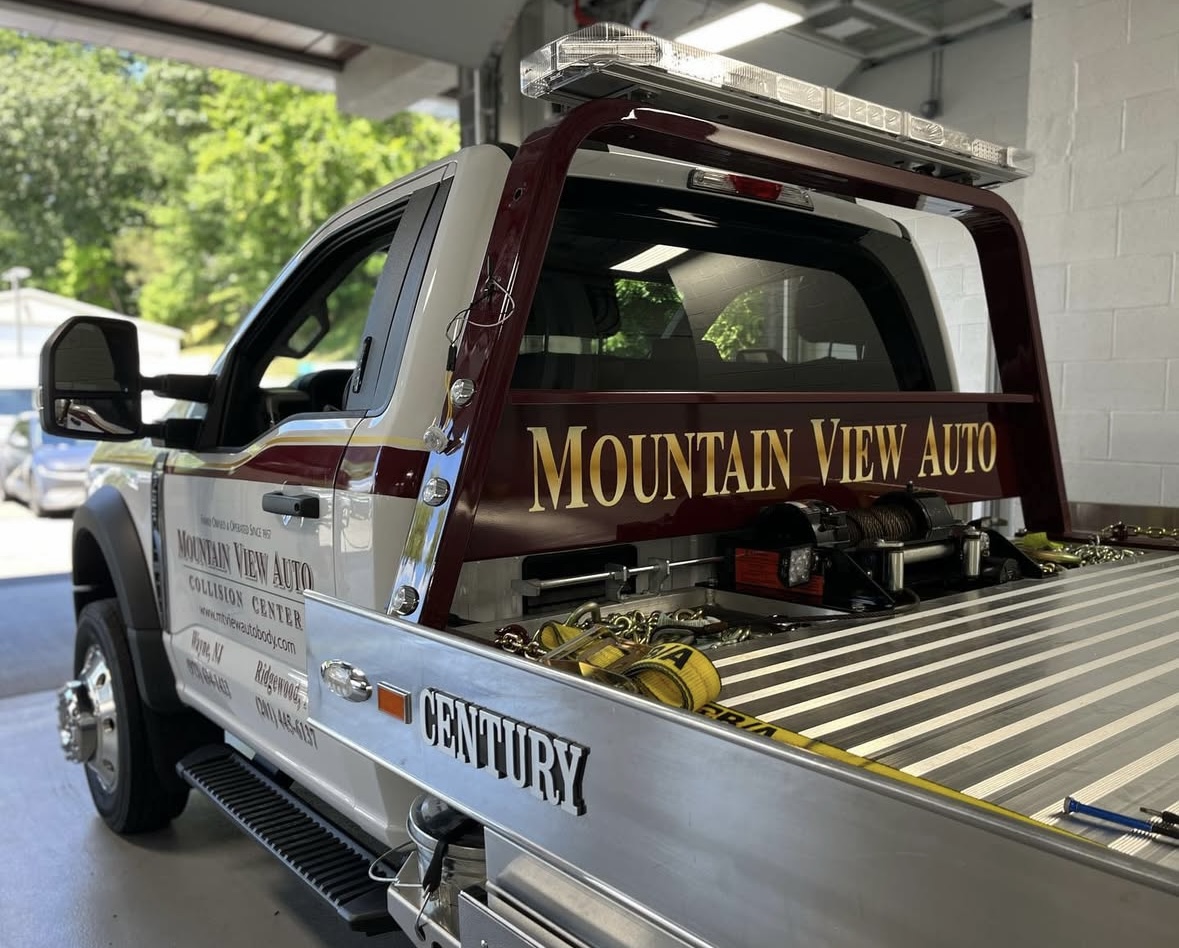
Edges are where a vinyl job fails first, and where a photograph tells the truth. Film laid over grease, dust or a cold panel lifts at the corners within a season, and the corner is the part a camera picks up. If the corners in a photograph are flat and tight against the paint, the surface underneath was prepared properly.
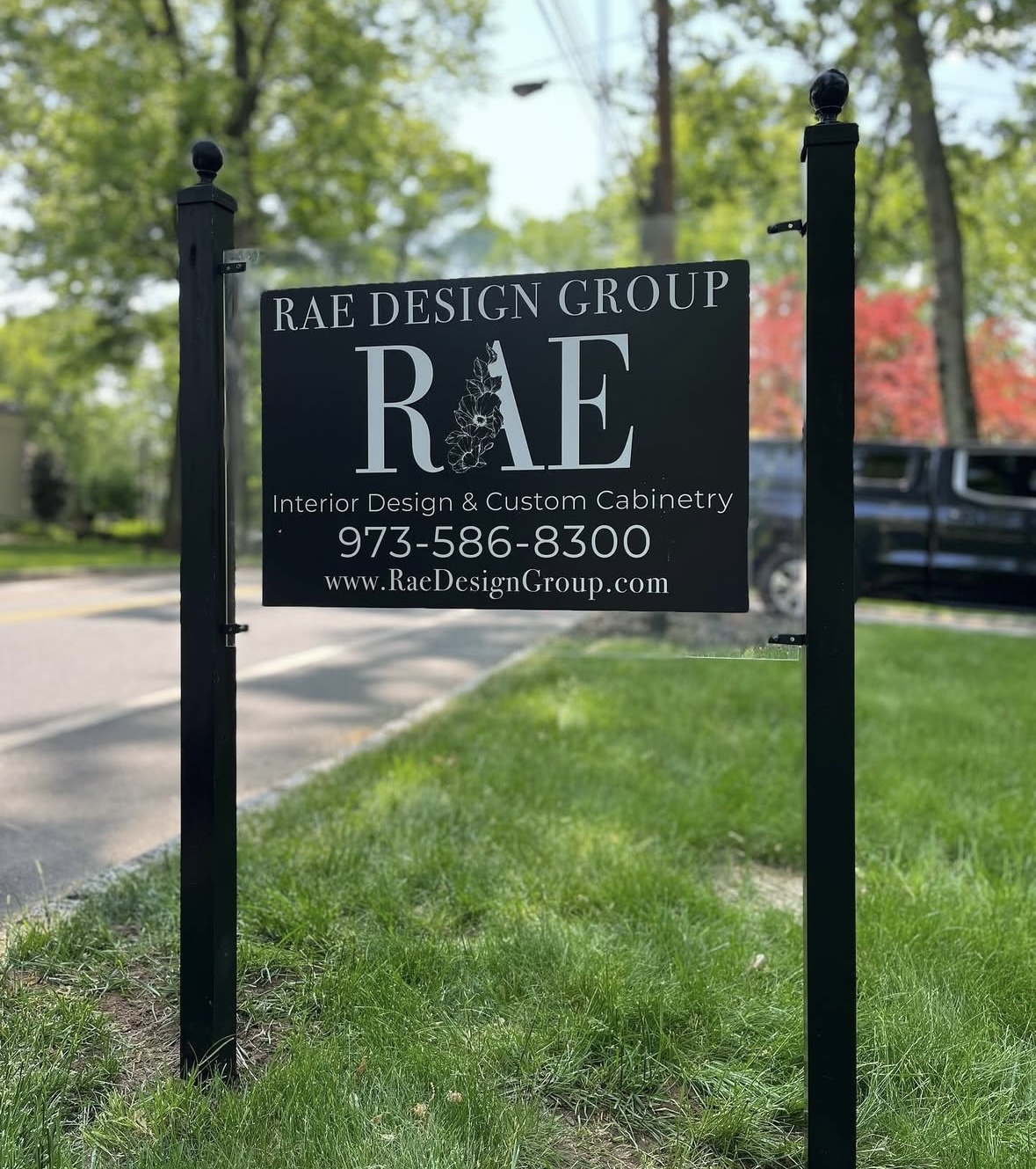
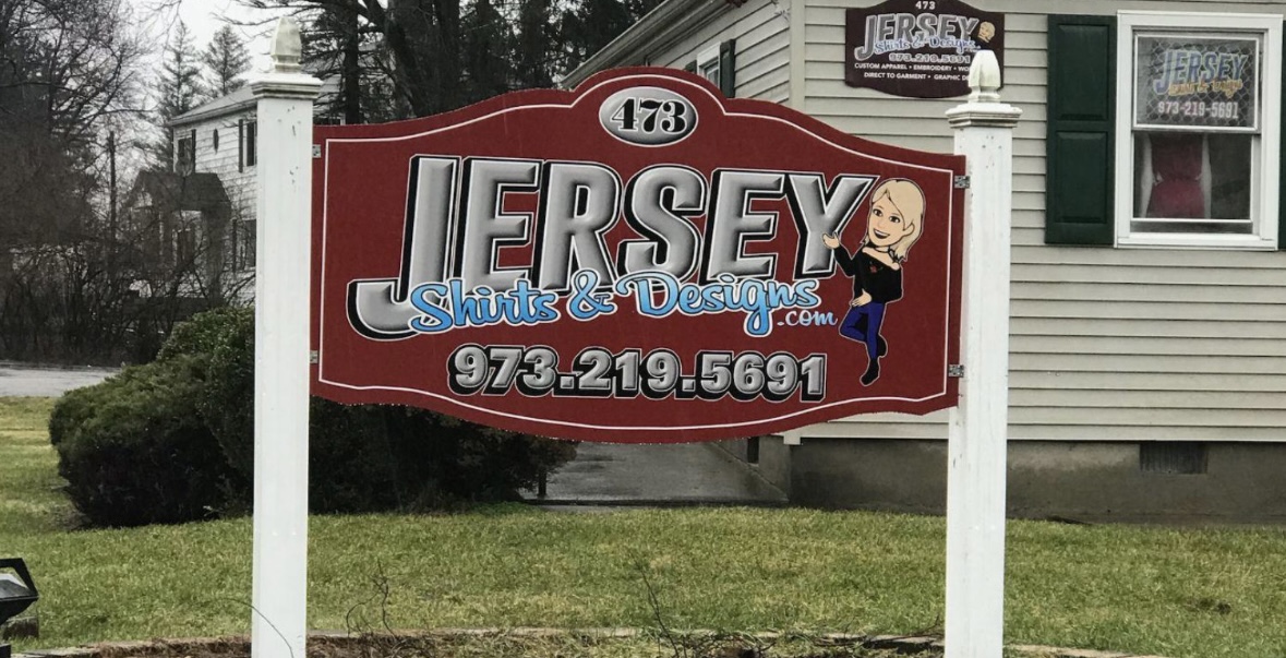
Spacing is the part sign painters call letterfitting, and it is the reason two identical fonts can read completely differently on the same truck. Letters are not spaced by equal gaps; they are spaced so the area between them looks equal, which means an A next to a V sits closer than an H next to an N. Software does not do this well on its own. When a name reads smoothly at a glance rather than as a row of separate characters, somebody adjusted it.
The curve matters on anything that is not a flat panel — cab corners, tailgates, rounded box edges, the compound curve over a wheel arch. Vinyl can be persuaded around all of these, but only with heat, patience and film chosen for it. Graphics that stop just short of a curve, or that wrinkle as they cross one, are the shortcut.
What a photograph cannot tell you is how long the vehicle was off the road, whether the shop came to the yard, or what the job cost. Those are the questions worth asking us directly.